
revamping Småtrollens website
Heuristic evaluation / Wireframing / UI Design
When
March 2023
client
Småtrollens föräldrakooperativ
The summary
Småtrollens Föräldrakooperativ is a parent cooperative preschool in Askim, Göteborg. They reached out to us to get help with updating their current website to modern standards. The team were tasked with producing their own iteration of a modern version of the website. My team evaulated the old website and produced several UI findings of issues that could be improved upon. After this, we set about wireframing and designed a fully functional mobile-first prototype of the new version which was showcased to the client.
The user
Parents and school staff
Role
UX/UI Designer
The challenge
Småtrollens Föräldrakooperativ's website was designed quite a while back. While it clearly adhered to design standards back in the day time had not been gentle to it and it was clearly outdated. Using our knowledge of expert evaluations and UI design, me and my team were to create a new iteration of the website which adhered to the standards of modern day design and which would stand the test of time more effecitve
The process
As a part of the UX team, I worked to redesign the preschool’s website. Firstly, I created a site map of the old website to identify areas where improvements could be made. With this in hand the team always had the possibility to go back and assess how the website was organized, should they run into roadbumps.
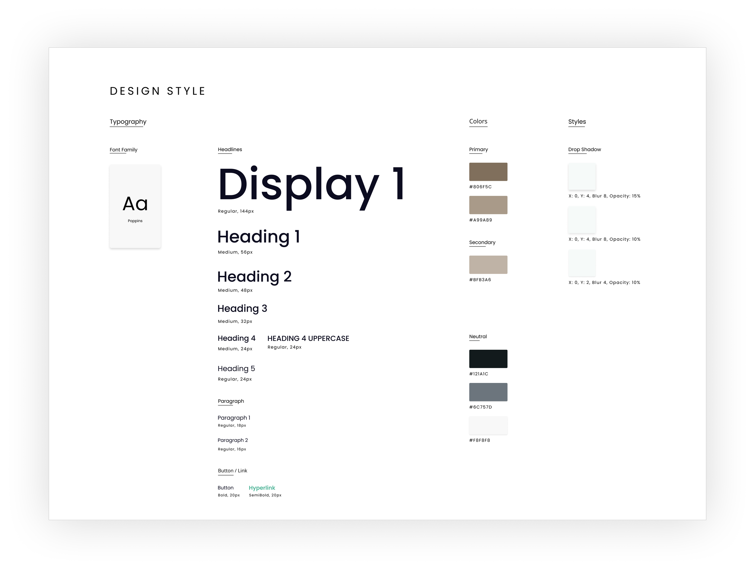
We then developed a new design system and moodboard for the website that was inspired by the preschool’s location and activities. Eventually we settled on a minimalist design, with an oceanic blue and a warm, earthy brown as the two primary colours. This was done also because in colour theory blue symbolizes consideration and peacefulness, while brown symbolizes warmth, relaxation and comfort. Sticking to the outdoors theme green was chosen as an accent colour. Taking inspiration from their name Småtrollen, which means “The tiny trolls”, I prompted in Midjourney v.4 to create a cute troll image that was incorporated into the website’s footer.
Next, we conducted an expert evaluation, with the help of NN Groups' 10 heuristics, of the old website to identify UI problems and compiled them into a document with improvement suggestions. Using that information, we created low-fi wireframes and a new site map that were later used to design a mid-fi render of the website.
My primary focus here was on creating an enrollment page as well as a contact page with user-friendly forms that included information on how to fill out each field. We also removed the original navbar and added a hamburger menu for a more streamlined approach to navigation.
To prevent the users from getting lost in the text, we used drop-down menus embedded into the hamburger menu to allow them to jump between different sections of the same page. We then presented a 100% completed prototype of the website to the client.
Overall, since we wanted to create an easy, fast to use website, we embraced minimalism as a concept. Through simplification of the features it allowed for a user-centric approach while at the same time it reflected the preschool’s theme and activities. This approach also made the website’s information presented easily accessible to users.


Lessons learned:
Kill your darlings:
Do not get overly attached to a design you’ve created. Everything is interchangeable and as a UX/UI designer this is an important lesson to be learned. Through doing this your rationale as a designer improves and your evaluations on a project will be sharper. Getting overly attached to a certain design that you prefer while the users don't share your sentiment will limit only yourself.
Simplicity is key:
Keeping things simple are a fundamental principle of UX design. A quote from Nielsen Norman Group website defining User Experience: “The first requirement for an exemplary user experience is to meet the exact needs of the customer, without fuss or bother”. This was something I learned to embrace in this project as we wanted to get the user to get from where they are to where they want to be quickly, efficiently and effectively.
AI is your friend, not your enemy:
We are many who have seen both The Matrix and Terminator and are rightly afraid of artificial intelligence. Sometimes maybe even more so now, seeing how AI can do create almost pixel perfect creations the same way a human designer would. Some claim that AI will take our jobs in the UX world, but I beg to differ. Working solely with Midjourney for an entire day, tweaking, coordinating and meticulously steering the AI image generator into the right direction, I came to realize that AI won't replace us. Instead we need to embrace it and learn how to shape it to our will. In the future, a good UX designer will be the one who knows WHAT to say to the AI and HOW to direct it to create the desired content. This is a whole new concept which I'm delighted to be a part of and learn from.
(Addendum: And oh boy how this has evolved in only a year! - Written in April, 2024)